UI Design • UX Design • Mobile
Project Overview
PCMag.com
Tech Media
2016-2017
Art Direction/UI Design/UX Design
PCMag.com, a leading tech media site, needed to reface there slideshow template based on continuous negative feedback from users and a desire to increase various business goals including ad impressions and page views.
UX Tasks I Completed: User Testing, User Interviews, Feature Analysis, Prototypes/wires
UI Tasks I Completed: Mid Fidelity Mocks, High Fidelity Mocks, Asset Library Creation, QA

Visual/Technical Issues
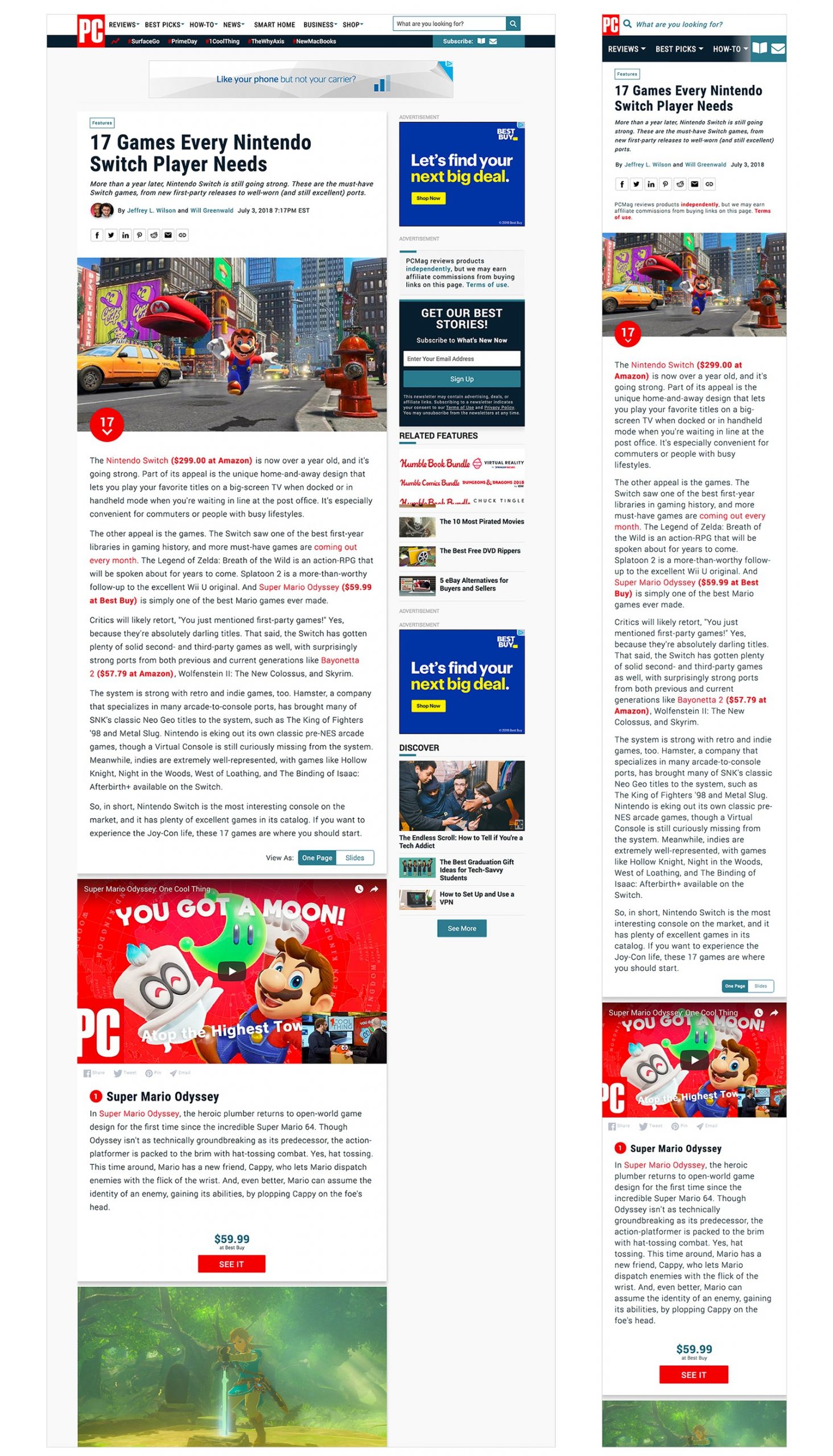
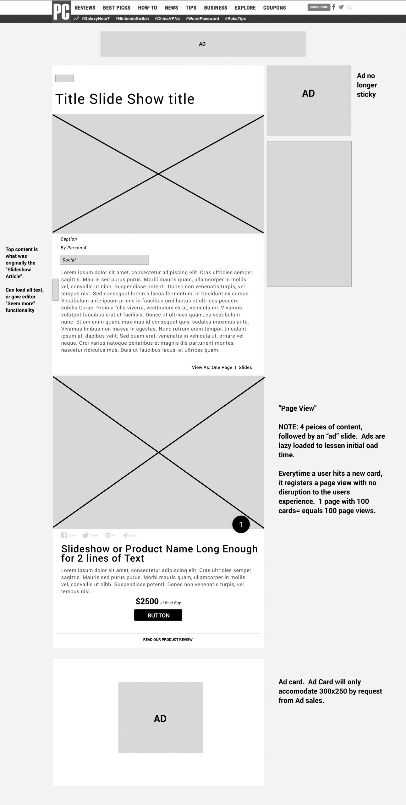
The mess I was tasked to fix was a segmented and visually non-uniformed slideshow experience. Due to the many requirements from departments such as Ad Sales and Commerce, the template had slowly become a monster focusing on monetization and not user experience. However, the continued growing negative feedback started to strongly affect outcomes and ultimately led to a all hands on deck redesign and rethinking.
Problem, Process and Direction
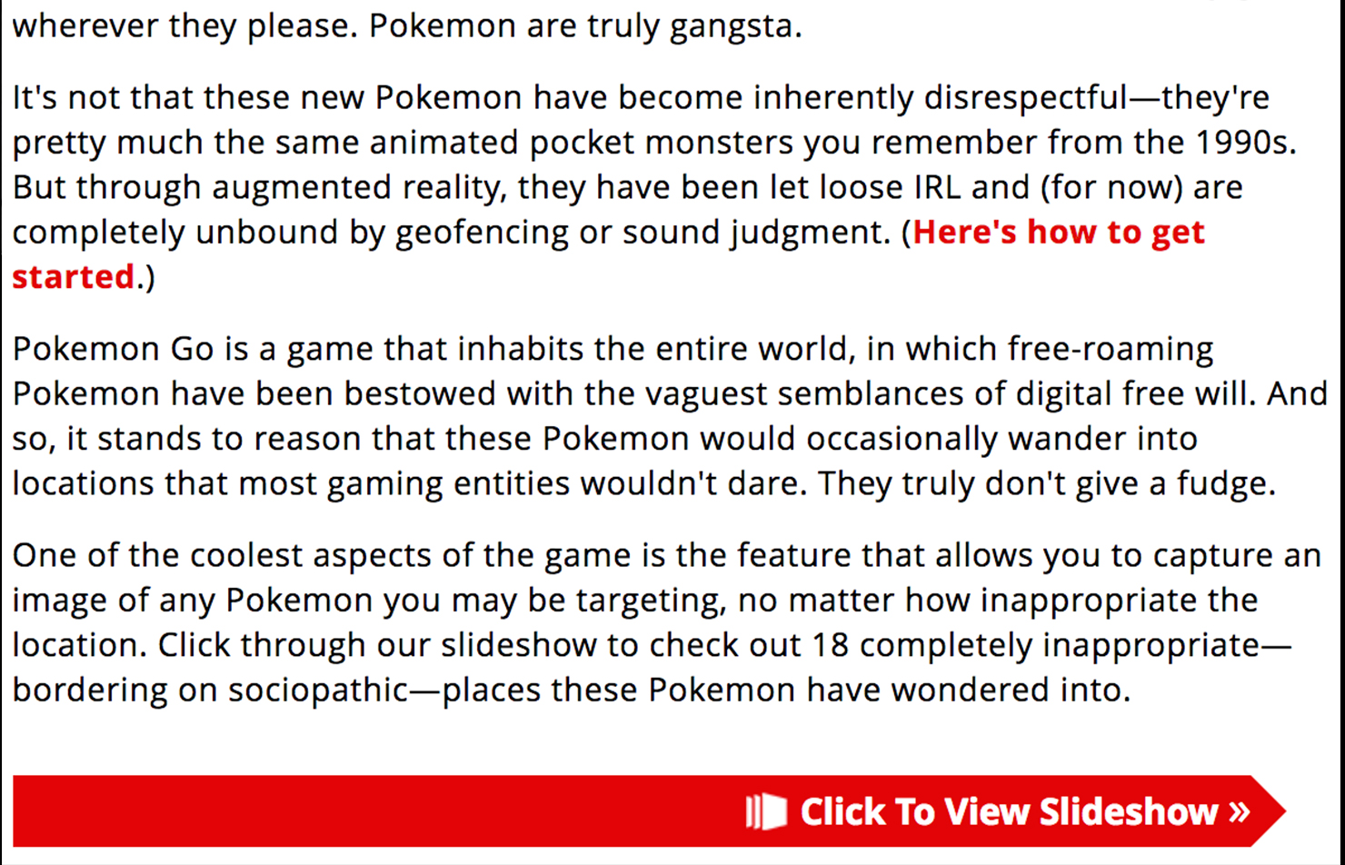
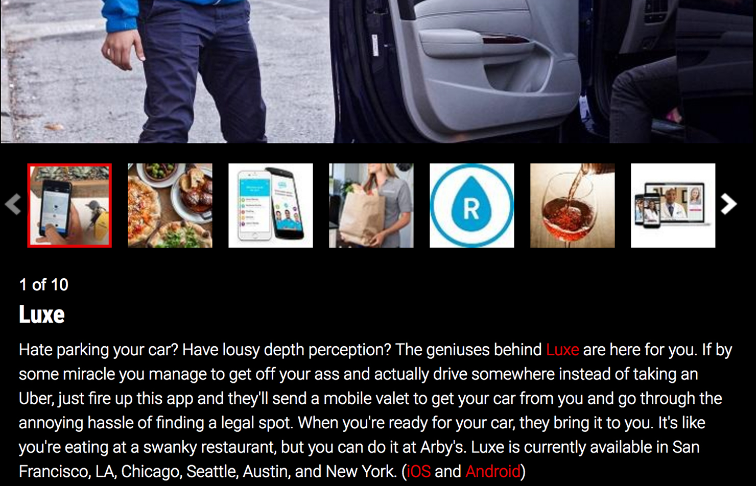
The current slideshow experience, as seen above, split article and image content into two separate pages. Upon landing on the slideshow page, a user would click through every slide. Each slide would throw off both a page view. Each click also triggered an ad refresh and impression. This flow and combined actions on click caused a slow, laggy and frustrating user experience. the result in many cases were high drop off rates between slide 3 and 4. The goal was to create a quicker, more user friendly image viewing experience. However, the project was also tasked with retaining ad impressions and page views. A dip of either would signify failure.
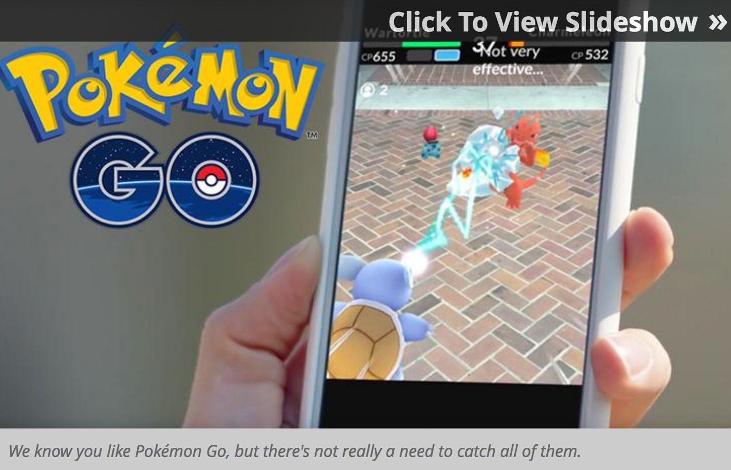
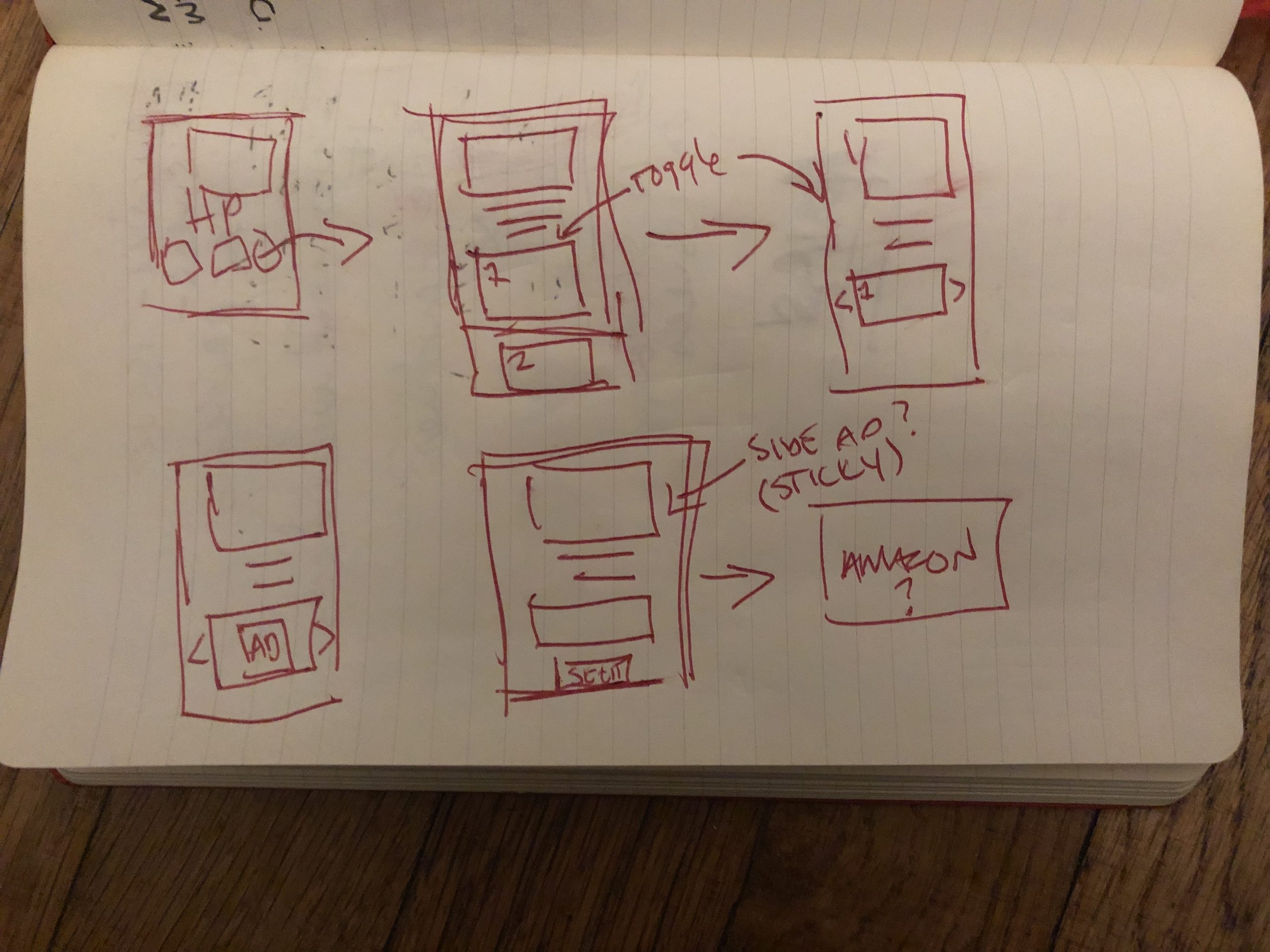
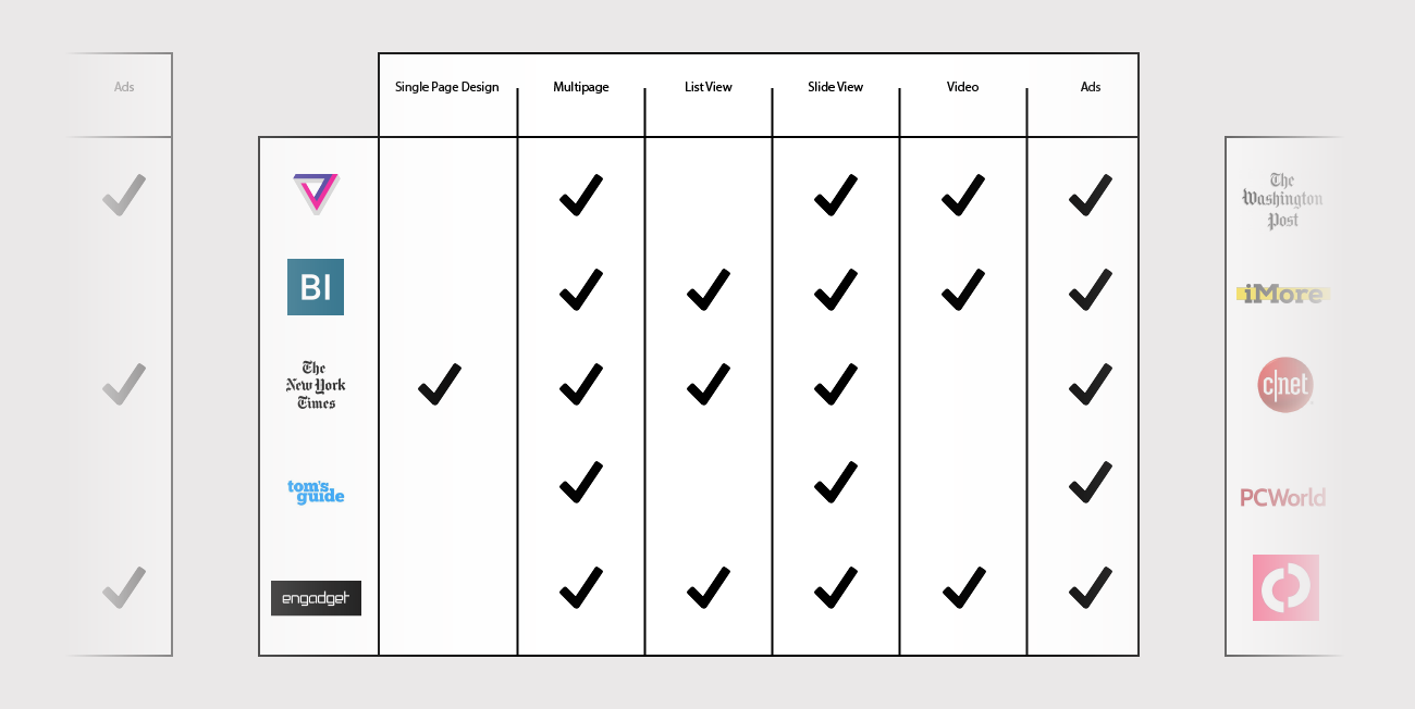
The project started with compiling user feedback, and using that as a foundation for initial steps and direction. Next I conducted analysis and research into what competitors and similar sites were doing. This including any type of image gallery, including slideshows, listicles and other long form delivery methods. The take away was that other sites were able to fire off various page views seamlessly or garner various ad impressions in one experience. However, none were doing both. this lead to a mix of quick sketches and one and one with the development team, working through constraints, concerns and ideas.

My Role
My role in this project was oversee the redesign of what ultimately became the “Feature” template. This included:
- Research : Who are the users? What are the goals?
- Meet in groups and 1 on 1 with key stakeholders.
- Working on a daily basis with the head of Product.
- Creating wireframes, low and high fidelity mocks for review. As well as updating each with feedback obtained throughout the process
- Working with the Engineering team to ensure designs feel within the technological restraints of the site.
- Creating both functional and design specs, writing up tickets and ensuring each portion of the project moved along according to deadlines.
- Iterate & test: user test where possible
- Overseeing the work of a Jr. Designer on related mini tasks.
Preliminary Sketches and Ideas
Feature Analysis & Research
Wires and Revisions
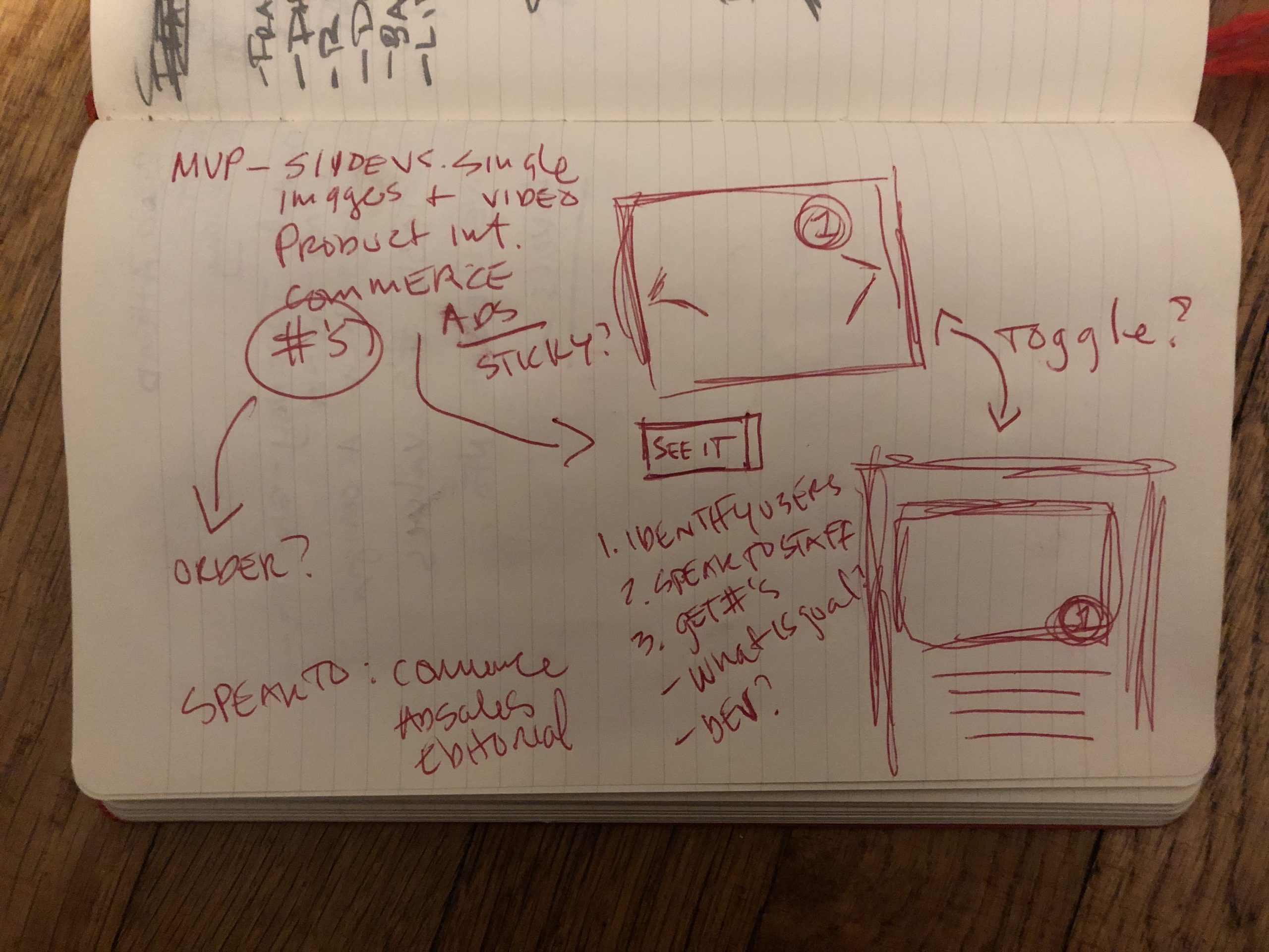
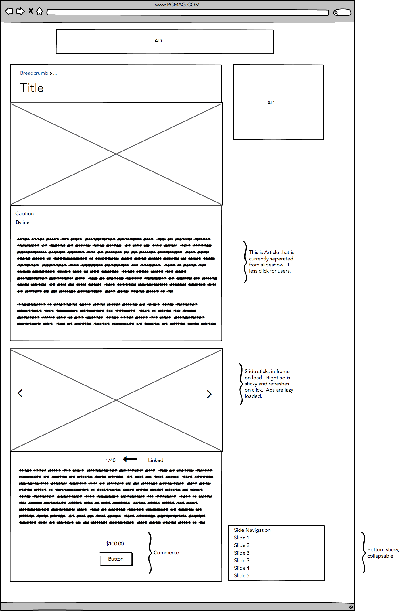
Due to needing approval from many stakeholders (Editorial, Marketing, Ad Sales, Commerce and Product). We decide to take our ideas and quickly put together low to mid fidelity mocks. This included a structure for “slideshows”and slide show articles, which we combined and renamed “Featured Content”. the featured content mocks included answers for ad impressions, page views and commerce, while also aiming to enhance the user experience.
First Mocks
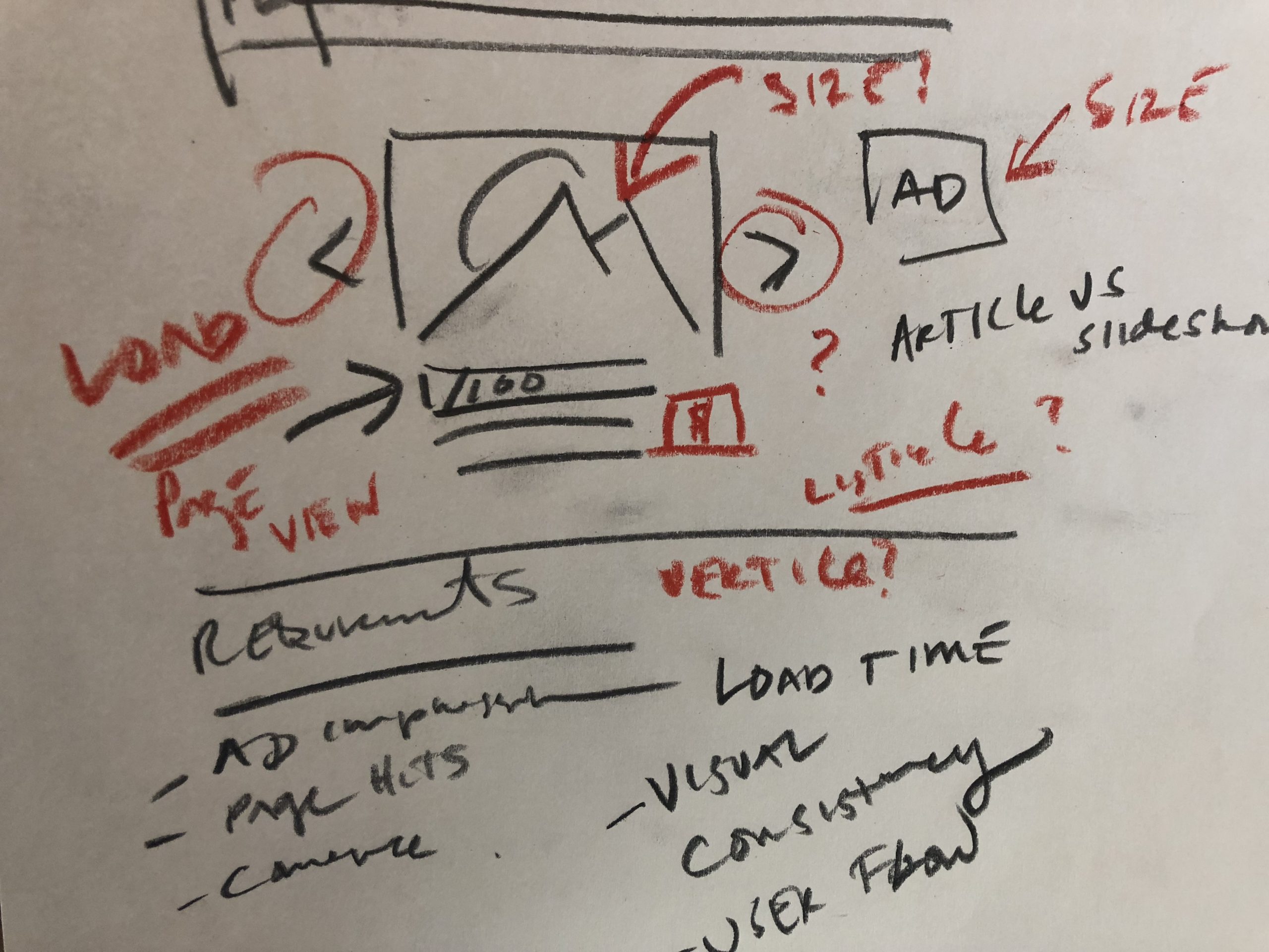
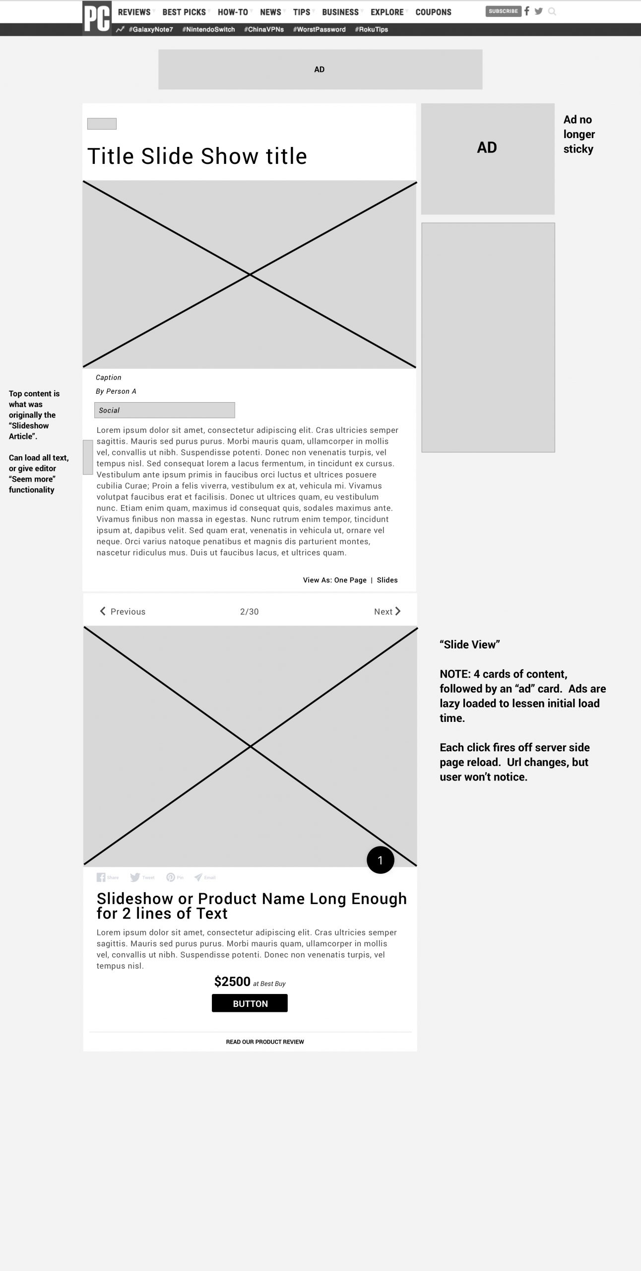
Upon getting approval of layout from stakeholders, we moved to high fidelity mocking. The final decision was to roll out a template tat offered both “slide” and “list” view, with list being the default on load. Several elements, such as the sticky sub-nav, were adding in this stage but ultimately were pushed back into a later development cycle. The MVP for the project included slideshow article template and slideshow template merging, slide/card view creation, social integration and product review linking. In addition to creating the new layout, it was also decided that the template would serve as guide to updating site-wide assets, including H1 type, commerce text style, article social buttons, commerce buttons and card attributes.
Product Rollout (MVP) and Results
Initial rollout included new template creation, Slideshow Article Template and Slideshow Template merging, design updates, commerce integration and Review Page linking. Post launch, several updates were rolled out on a weekly and sometimes daily basis, including visual button tweaks, enhanced Review page link visuals, slide number visual updates and functionality including the ability for Editors to reverse number orders or hide numbers completely.
Post launch analytics showed a dramatic uptick in both ad impressions and page views. User surveys showed a 40% increase in satisfaction, and almost no sign of negative feedback pertaining to the slideshow experience.
Increased functionality on this template allowed Editors to utilize it for stories and write-ups beyond simple image slideshows. within a month it had become the most popular and utilized template across the site.