UX • UI • Mobile
Project Overview
PCMag.com
Tech Media
2016
Art Direction/UI Design/UX Design
One of PCMag’s top performing pages are there Roundup page. These pages take 5-10 products and compile testing data to provide consumer comparisons. While traffic and engagement were high on Desktop, they saw a severe decline in both Tablet and Mobile engagement and conversions. The original goal was to redesign the page from Desktop down to Mobile, However, as the project progressed, it was decided that the MVP would only include Tablet and Mobile. the rationale was tied into various business goals and the need to launch in stages to test impact. The updated goal was to create a tablet and mobile specific experience that could both help increase engagement on those pages at those viewports and serve as visual direction for a possible update of the outdated (but currently steady performing) desktop pages. Below I will show all assets leading up to the final MVP. these include the original desktop wireframes that later lead to a refresh and update.
UX Tasks I Completed: Sprint Planning, Usability Testing, Feature Analysis, Prototypes/Wires
UI Tasks I Completed: Low/Mid Fidelity Mocks, High Fidelity Mocks, Asset Library Creation, QA
Process and My Role
For this project, I worked very closely with the Director of Product to create and oversee a 5 day intensive Design Sprint. The breakdown, was loosely based on the process developed by Jake Knapp of Google Ventures. However, many tweaks and changes had to be made to git the company and various individuals schedules. This was the first time something like this had ever been attempted at PCMag. This process also served as direction for a future push into a quicker, multi-release agile workflow. Up until this point, projects were done in 1-2 week pushes. During the 5 day sprint, I brought together all major stakeholder on a daily basis, which included the Directors of Commerce, Ad Sales, Editorial, Marketing and Product. Starting from the present day, we worked from idea, to sketch to low/high fidelity on a systematic daily basis. We performed internal User Testing, a Comparative Feature Analysis and multiple rounds of mocks. This process enabled us to not only get direct feedback on direction, but allowed the heads of the different departments to hash of conflict and discrepancies in real time. Overall allowing us to go from idea to full launch in weeks rather then months.

The Sprint week (in summary):
- Overview and critique of current design.
- Identification of Problem and department specific goals.
- User flow mapping.
- Target audience Identification and discussion.
- Idea sketching.
- Revisiting problem and solutions.
- Crazy 8's exercise.
- Solution Sketching.
- Beginning of MVP vs. Final Product discussion.
- Voting and MVP decision making.
- Storyboarding.
- Revisiting problem and goals.
- Desktop incremental update discussion.
- Lo-fi Protyping.
- Rev-visit MVP
- Technical discussion.
- Rollout plan breakdown.
- Mid level mock.
- Revisit MVP (additions/changes)
- Technical discussion pt. 2
- Rollout and next steps.
Wires and Revisions
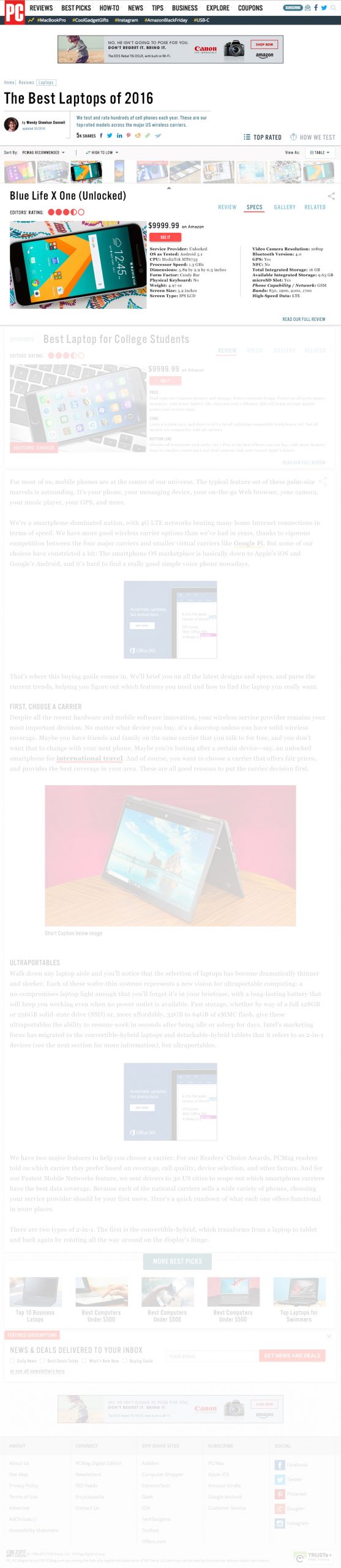
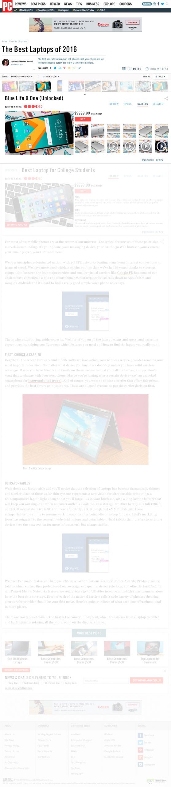
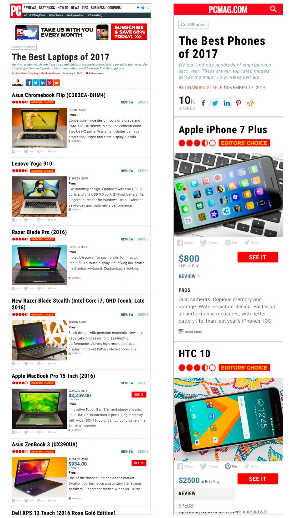
As stated above, the original project was focusing on all viewports, with a main focus on rethinking Desktop. As with many projects, the goal shifted as the project progressed. While many aspects of the Desktop iteration were implemented in stages post-launch, the biggest launch updates were to tablet an mobile. These pages took the card layout that is seen throughout the low and high fidelity mocks. The cards allowed for better structuring of content and bigger, more eye catching photos.
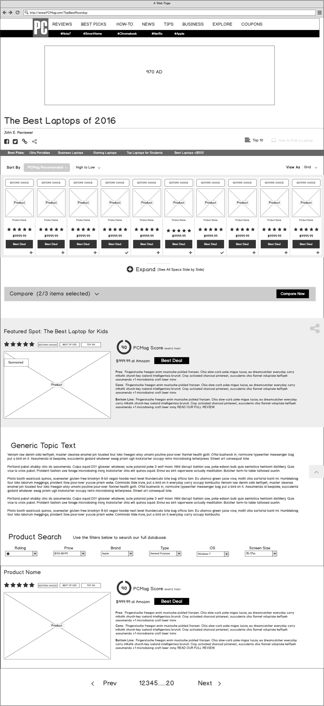
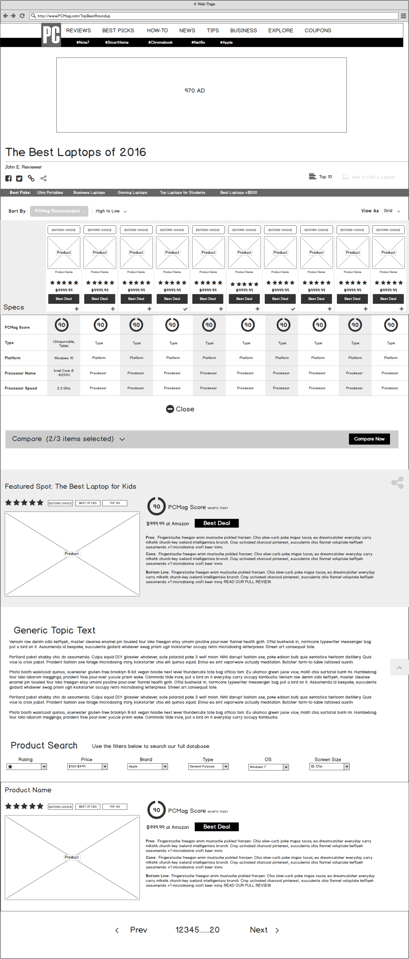
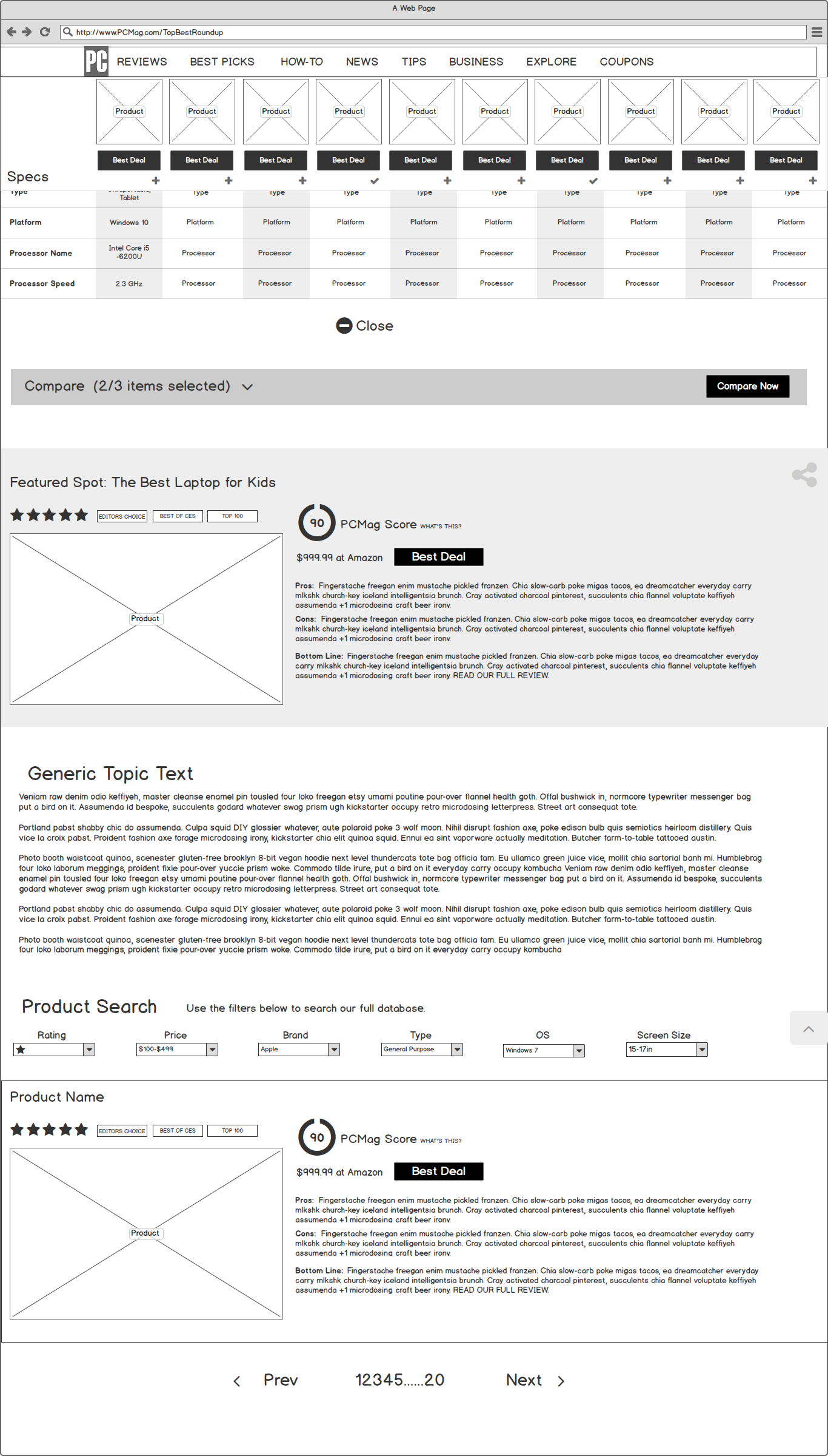
High Fidelity Mocks (Desktop Focus)
Project Shift:
High Fidelity Mocks (Tablet and Mobile)
Project Shift:
High Fidelity Mocks (Tablet and Mobile)